Dashboard Studio: Level-Up Your App with Dashboard Studio

Dashboards are a powerful tool for communicating a lot of information at once. Many Splunk apps are packaged with dashboards to help you make the most of your data. For example, the Microsoft 365 App for Splunk comes with a number of dashboards to provide insights around usage, incidents, and more.
Classic SimpleXML
Here's the M365 Overview dashboard, built with Classic SimpleXML.

This dashboard provides a great overview of the Microsoft 365 suite of applications, but as you can see, the panel layouts are fairly rigid. This leads to wasted empty space under the OneDrive column chart, and around the various application icons. In general, the dashboard looks blocky and the colors are dull.
Dashboard Studio
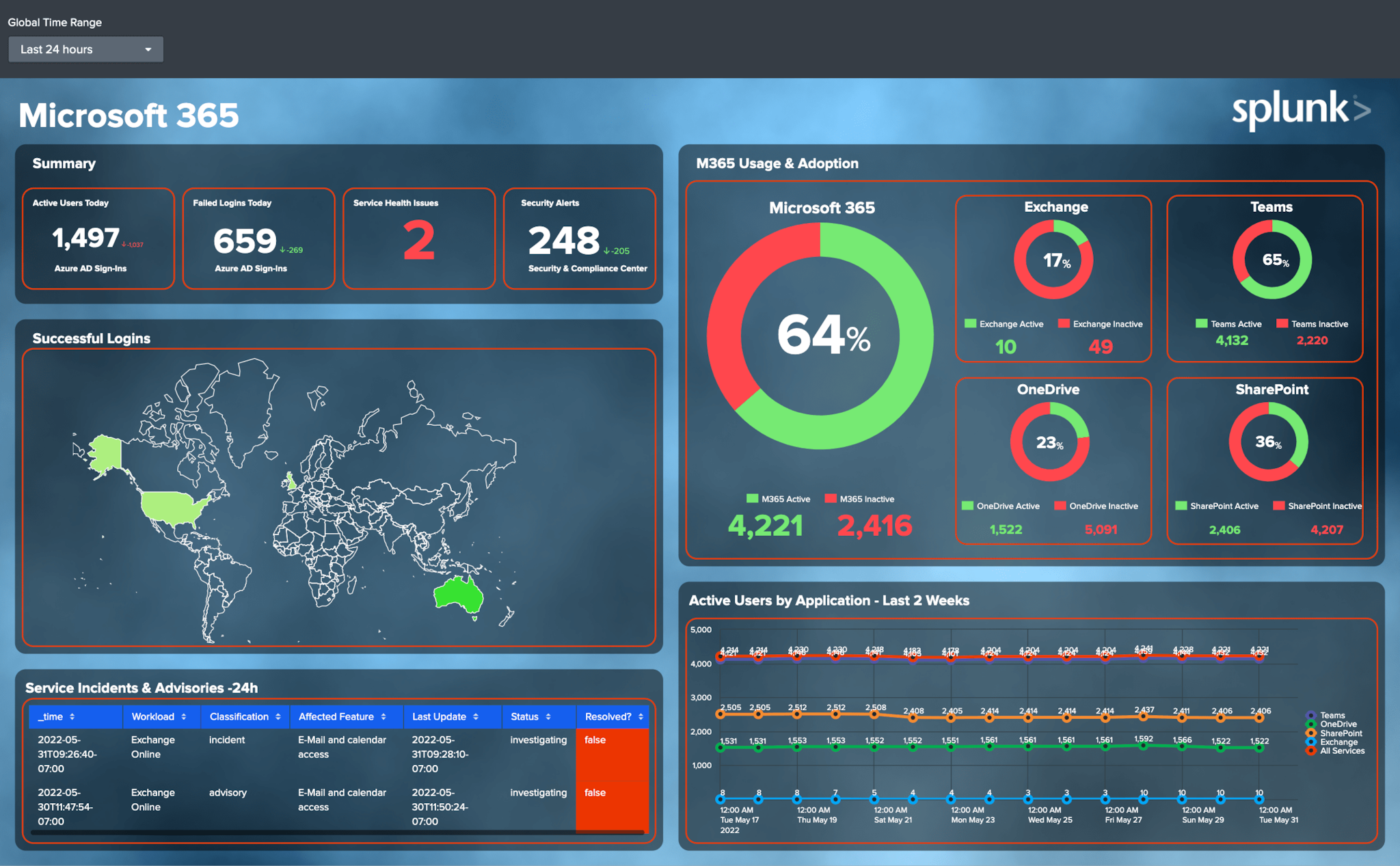
In the most recent version of the Microsoft 365 App for Splunk, version 3.3.0, you'll notice a handful of new dashboards built with Dashboard Studio. Dashboard Studio provides native support for pixel-perfect layouts, shapes and text boxes, images and more. Let's take a deeper look at how the refreshed Microsoft 365 dashboard takes advantage of all these Dashboard Studio capabilities.

Pixel-perfect Layout
Note how the Microsoft 365 dashboard groups and layers multiple donut charts and single values in the top right section "M365 Usage & Adoption". Not only are single values included inside the donut chart to represent usage percentages, but single values are also placed below the donut chart legends to show the actual count for each category.
Shapes and Text Boxes
This dashboard also heavily leverages shapes and text boxes to visually indicate which metrics and charts are closely related, or not. There are dark rectangles with rounded corners behind each of the charts, which help to provide contrast from the background as well as group relevant metrics together, such as the high level KPIs in the "Summary" box. Text boxes are used throughout the dashboard to provide labels, titles, and additional context.
Images
Images can be used in a variety of ways to put some polish to your dashboard. Background images provide more interesting backgrounds than the standard light or dark theme. Even if they are just a subtle pattern or gradient, they make a huge difference! Images can also be used for logos and company branding, as you can see with the Splunk logo in the top right corner.
Below is another example of a new Studio dashboard, the Defender 365 Overview dashboard.

In this dashboard, you can see more examples of how grouping and overlaying visualizations together provides more context for the information displayed. For example, under "Incident Disposition Stats" on the left, you can see the larger single values represent the count of incidents by category, and the smaller single values represent the percentage. This helps the end user to more quickly gain an understanding of the current status.
Flexible layout options mean that more space can be allocated for visualizations that require it, like the bar graph in the bottom right.
Level-Up Your App with Dashboard Studio
If you want to level-up the dashboards in your app as well, here are a few things to keep in mind as you get started:
- Dashboard Studio's flexible layout means you can put more information into a single view. Consider how grouping or overlaying visualizations together can help get your message across, with less space.
- New objects like shapes and text boxes can be leveraged to provide more context to your end users by visually grouping certain charts together and providing labels or other information.
- Support for images helps you bring that extra level or polish to your dashboard with a background image or company branding.
Resources to Get Started with Dashboard Studio
If you're new to Dashboard Studio, here are some resources to get you started:
- Dashboard Studio Tutorial
- Dashboard Studio Tech Talk
- Splunk Dashboard Studio Documentation
- Splunk Ideas - Dashboard Studio for feature or enhancement Requests
- Examples Hub - Find the Examples Hub from the Dashboards page in Search & Reporting
- Splunk Community - Dashboards & Visualizations for questions
Related Articles
About Splunk
The world’s leading organizations rely on Splunk, a Cisco company, to continuously strengthen digital resilience with our unified security and observability platform, powered by industry-leading AI.
Our customers trust Splunk’s award-winning security and observability solutions to secure and improve the reliability of their complex digital environments, at any scale.


