Advanced Painting with Data: Choropleth SVG

In my last blog post, "Painting with Data: Chloropleth SVG," about the all new Splunk Dashboard Beta Framework, I provided some ways to dynamically “paint” SVGs using data. That blog came out with the Splunk Enterprise Dashboards Beta 0.5.2, but the app has now advanced all the way up to version 0.9.0 and has many new exciting features. As a result, I feel I’m overdue for giving the world another SVG art class, and so I present to you: Advanced Painting with Data.
Dashboard Examples
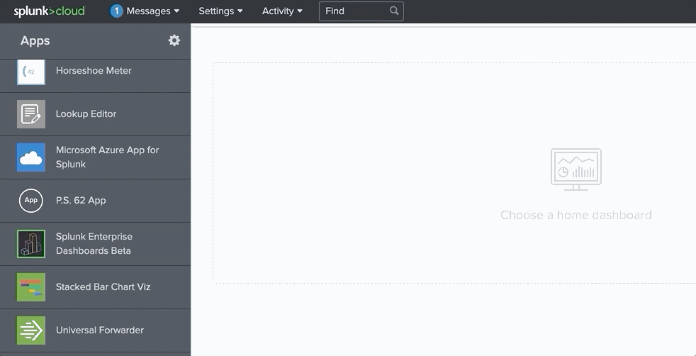
In this blog I’m going to cover a few really cool, more advanced, examples of visualizations that can be created using our Choropleth SVG feature. I found these to be useful while helping Splunk for Good partners find success with the new dashboarding framework. Best of all, I’ve contributed all of these to the Examples portion of the new Splunk Enterprise Dashboards Beta. Simply install the app in your Splunk Enterprise or Splunk Cloud Environment, and view the Examples in the app navigation. This portion of the app gives you access to all of the code (and SVGs) for replicating exactly what I’ve done in this blog. As a result, you may not see too many code examples listed in this blog, as the majority of the code for making this possible is now baked inside of the app.
The examples I’ll cover here are as follows:
- Turning any SVG into a gauge
- Painting an SVG with patterns (instead of just plain colors)
- Using emojis in your searches
- Animated SVGs
Gauges
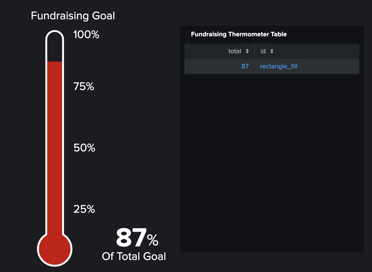
Custom gauges are something I get asked about a lot. When I talk about turning an SVG into a gauge, what I mean is taking an SVG, and dynamically changing the level of fill for that SVG. This winds up being a very compelling use-case for some dashboards. You can start to turn any SVG into a gauge by leveraging our Splunk Enterprise Dashboards Beta Encoding, and linear Gadients in SVG. For a simple example to show you what I'm talking about, I’ve opted to use a classic thermometer style gauge that is commonly used for fundraising. So, do you have a fundraising goal you’re trying to hit? Why not keep track of it on a Splunk Dashboard.
I’m sure the next piece of feedback I’ll hear is that this particular gauge may look similar to some of the out of the box gauges we have in the Splunk Enterprise Dashboards Beta. As a result, you might be skeptical of the coolness factor of this particular visualization. If that is the case, then allow me to double click on the fact that just about any SVG can now be a gauge. I present to you an SVG of the entire United States, where every single state is it’s own gauge. In the image below, I ran some simple SPL to generate random percentages for each state in the US, and I refreshed the map so you can see that these individual gauges change as expected:
SPL:
| makeresults
| eval State="Alabama, Alaska, American Samoa, Arizona, Arkansas, California, Colorado, Connecticut, Delaware, District of Columbia, Florida, Georgia, Guam, Hawaii, Idaho, Illinois, Indiana, Iowa, Kansas, Kentucky, Louisiana, Maine, Maryland, Massachusetts, Michigan, Minnesota, Minor Outlying Islands, Mississippi, Missouri, Montana, Nebraska, Nevada, New Hampshire, New Jersey, New Mexico, New York, North Carolina, North Dakota, Northern Mariana Islands, Ohio, Oklahoma, Oregon, Pennsylvania, Puerto Rico, Rhode Island, South Carolina, South Dakota, Tennessee, Texas, U.S. Virgin Islands, Utah, Vermont, Virginia, Washington, West Virginia, Wisconsin, Wyoming"
| eval State=split(State,", ")
| mvexpand State
| table State
| eval total = random() % 100
| table _time State total
Resulting Map:
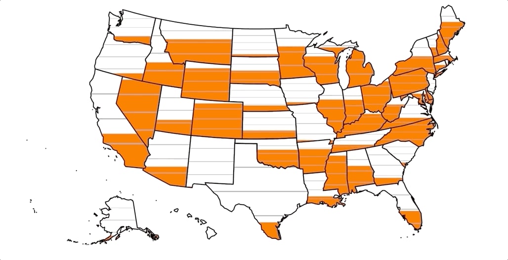
I’ve also added three lines on each individual gauge above to indicate thresholds of 25%, 50%, and 75%. So if you wanted to compare the fundraising progress across all 50 U.S. states, you could do so using an SVG map. As states or “gauges” fill up, it would mean that the state is closer to their individual goals.
Patterns
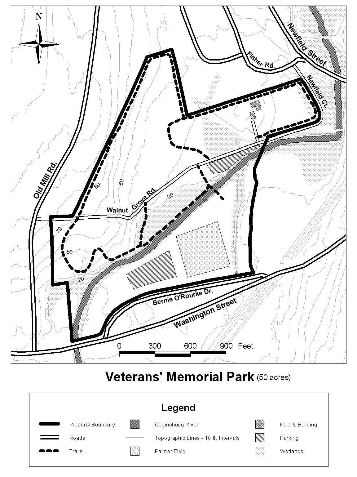
Oddly enough, this next visualization was inspired by the time I’ve spent in the woods. If you’re an avid hiker like myself, you’ve probably run across a map that looks something like the one on the right. This map is great for a couple of reasons. Primarily, notice how the artist accounts for color differences that are subtle and hard to differentiate. Using a standard color palette in an SVG in Splunk is generally completely acceptable given modern displays. This map creator however needed to find other ways to notify the reader of differences in portions of the map. I wanted to think outside the box a bit and see if I could create what I found on this map, in Splunk. I started out pretty basic, creating a map made up of patterns of various lines and other patterns. There was actually a helpful github repository of monochromatic patterns that I was able to utilize quite easily to create the map below.
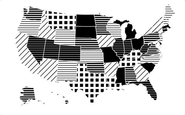
When I say patterns, I do mean we are relying on the SVG <pattern> attribute for this. Some of you may think what I've shown is great. Others may be saying "I liked plain old colors, can't you leave well enough alone?" If that's your reaction, than be buckle up for this next visualization. When I started thinking about patterns and the cold weather season, I thought “Why not a nice Plaid pattern?”. Miranda Luna and I even joked about seeing if a nice houndstooth might be possible as well. And so I was able to actually use base64 encoded images as patterns.
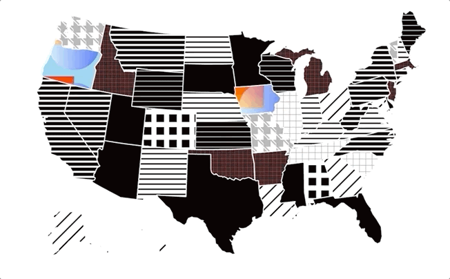
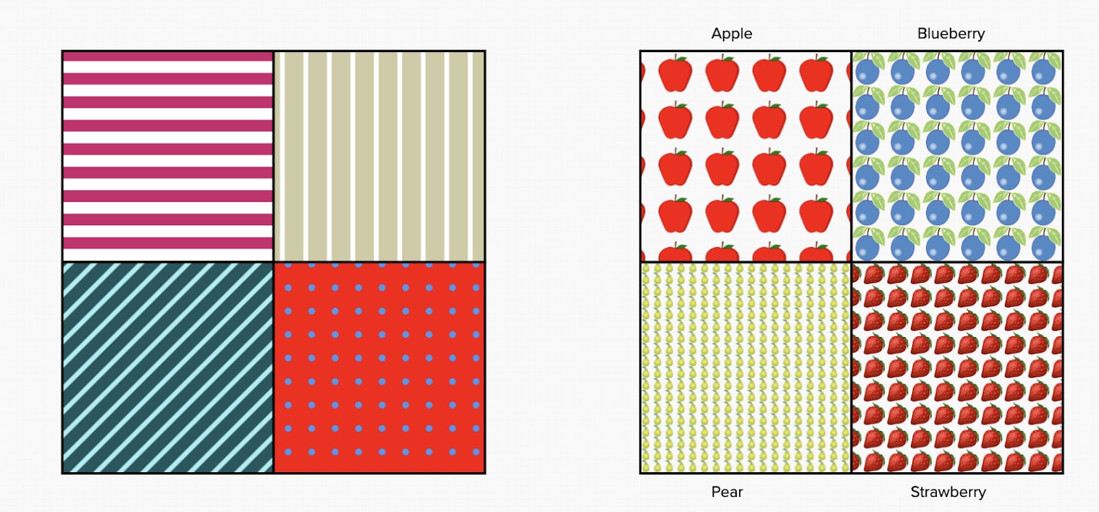
If you want to generate some of your own patterns using the github repository mentioned above, I highly recommend the npm package. This package allows you to pretty easily generate SVG patterns using a CLI. Here are some example commands of how I generated colored versions of some of the monochromatic patterns above.
patternfills -f svg -g #18575C -b #A2EFF4
patternfills -f svg -g #CF1D6D -b #fff
patternfills -f svg -g #D0CBA3 -b #fff
patternfills -f svg -b red
As we move towards these more advanced dashboarding frameworks where possibilities are endless, we have the freedom to create anything. With that power, comes great responsibility. It is that much easier to distinguish one pattern from another when using colors and so you should always consider that for your dashboard viewer. Though I think monochromatic pattern fills look really interesting, it doesn't mean it's going to be accessible for your viewers, so please keep this sort of thing in mind. That being said, if you really want to set your dashboard apart and not stick to just stripes and dots, why not try on some of your favorite fruits?
Animated SVG
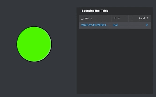
I would say many of these visualizations are somewhat "forward thinking" for dashboards, but none more so than animated SVGs. This is mostly because I haven't seen a lot of animated SVGs in production yet, and I can't think of a wide range of use cases right now - but I’ve had a few requests for things like this. Animated SVGs can take data to interesting, new, and creative places. For example, in the visualization below, we not only see a numerical value of how fast a gear is spinning, but we can actually see the gear spinning at different speeds based on data. On the right we can see a ball that is sort of growing and shrinking. In the examples hub, you’ll notice this ball changes colors also based on the data when the page is refreshed. Consider these two simple animated SVGs as a jumping off point for what is possible.
Emojis
Last but not least, let’s talk about emojis. These little treasures are the underdogs of Dashboarding in Splunk. They might seem like a novelty that you use in text messages - but they are the dark horse in the race for getting creative with dashboards. Every time you think to yourself “I need a simple image of…” I would encourage you to think about emojis. I’ll give you an example around sustainability that I came across.
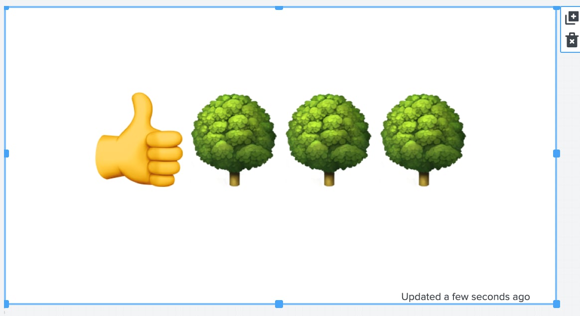
I had a customer who was really interested in sustainability. Because we are ingesting data from their Energy Management System - including energy produced by Photovoltaic Panels - we were able to run a simple calculation to say “X amount of energy produced is roughly equivalent to this Y number of trees saved”. I thought long and hard about how to dynamically show a number of different trees, but eventually I realized I should keep it simple. With a little bit of SPL and Emojis, I could write some SPL that looked like this:
| makeresults
| eval today_kwh=300
| eval today_kwh=today_kwh/100
| eval today_kwh=abs(today_kwh)
| eval idx=mvrange(0,today_kwh,1)
| mvexpand idx
| eval text="Yes"
| map maxsearches=1000 search="| makeresults | eval trees=\"🌳\" | table trees"
| stats list(trees) as trees delim=""
| nomv trees
| eval trees="👍".trees
To generate a dashboard like this:
Let’s Wrap it Up
What I found through this effort, is that the SVG feature in the Splunk Enterprise Dashboards Beta has lots of potential. Imagine having a data paint brush that can paint animated stories with just about any image you can create, or find around the web. The ability to utilize emojis as well has really expanded what I thought to be possible with dashboards. I encourage everyone to download, and install this new Splunk Enterprise Dashboards Beta 0.9.0 and make the most of what dashboarding can look like in Splunk.
Related Articles
About Splunk
The world’s leading organizations rely on Splunk, a Cisco company, to continuously strengthen digital resilience with our unified security and observability platform, powered by industry-leading AI.
Our customers trust Splunk’s award-winning security and observability solutions to secure and improve the reliability of their complex digital environments, at any scale.

