Painting with Data: Choropleth SVG

 With the release of the Splunk Enterprise Dashboards Beta version 0.5.2 comes an exciting new feature that I’m sure many people will find useful: Choropleth SVG Objects. What are Choropleth SVG Objects? Put simply, it’s painting with data.
To help you navigate getting started with the current iteration of this feature, I’m writing a blog to show you just how easy it is to use and create absolutely custom SVG objects. Additionally, I want to show you some tips and tricks for creating your own powerful Choropleth SVGs out of your old KML files you may have lying around from Simple XML.
Let’s Start with the Basics: What is an SVG?
SVG stands for Scalable Vector Graphics. These are scalable, XML-based, files that can be used by modern browsers to render images. Within these SVG files, there are “paths” defined — a path can represent just about anything. Within the context of using them in Splunk, a path is generally a shape and it may represent: a room, a floorplan, a building, a state, a country, or almost anything you can think of. As an example, below is a very simple SVG file and dashboard that I dub the “Hello World” of SVG objects in the new Splunk Dashboards framework. It contains a piece of text, and three different rectangles. They’re mostly meaningless in comparison to a map, but they will help you understand the fundamentals of of Choropleth SVG.
Simple Custom SVG Creation
Were you a fan of MS Paint back in the day? Creating an SVG file can be almost as simple and fun as using MS Paint was. Inkscape is a powerful and entirely free application for getting started with creating SVGs. It’s not the only tool for doing this, but it is one that is freely available and one that I personally use. Keep in mind there are plenty of other vector graphics tools in the market. Also, SVG Creation is not a “one size fits all.” There may be nuances that you’ll need to think through as you get to more and more complex use cases, but the basics are all here.
To create a custom SVG from scratch:
- Download Inkscape (or your favorite SVG creation tool of choice)
- Draw your SVG
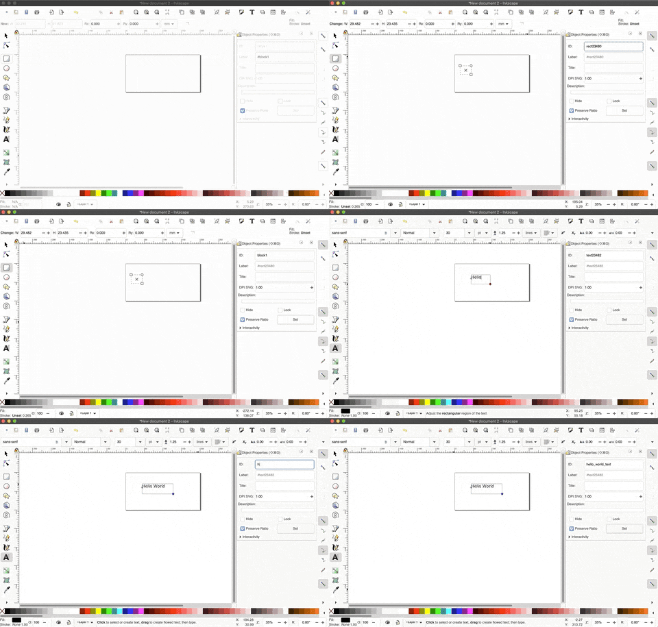
- Assign ID Tags to the objects you’ll want to “paint”. Keep in mind that this ID Tag will be used in combination with your Splunk search. So your ID should be a key from your Splunk Search. If your SVG is a map of your county, and you want to “paint” the cities inside of your County, you’ll want the ID for each City in the SVG to be the exact City name inside of your Splunk data. This matching is case sensitive. See the example below of assigning ID tags.
- Export the file by clicking File > Save As…
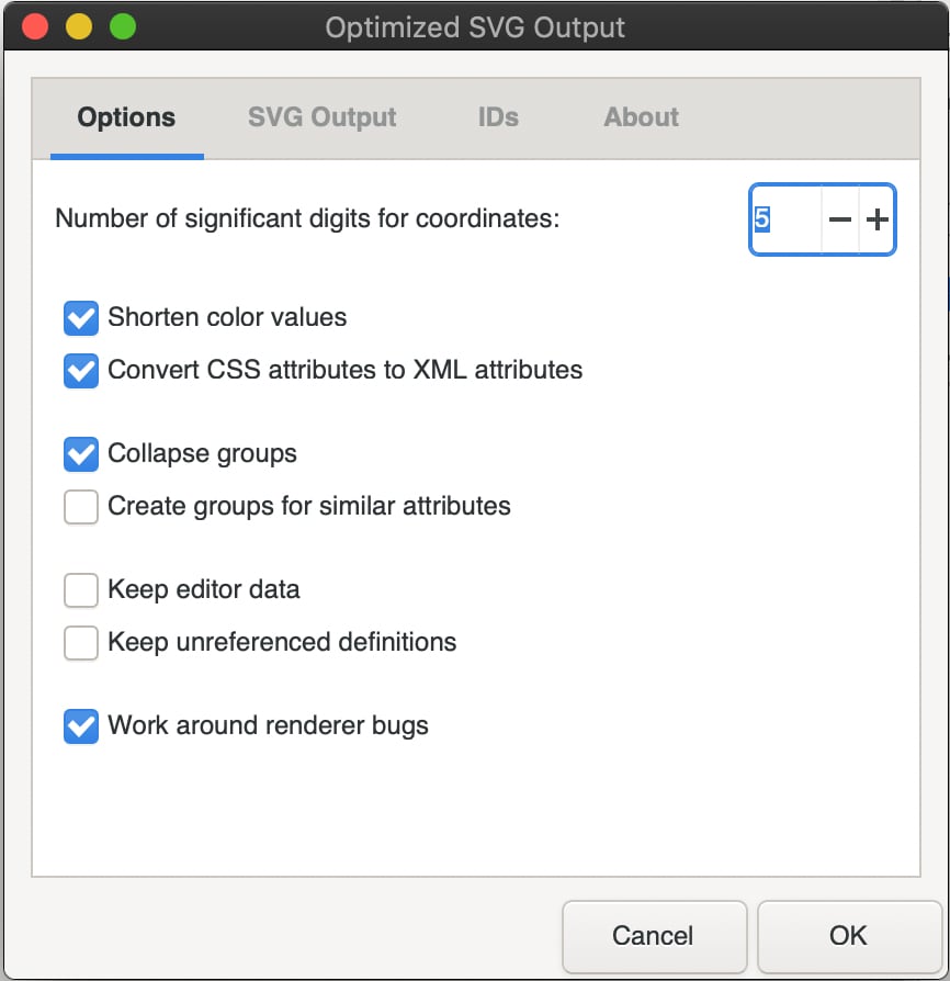
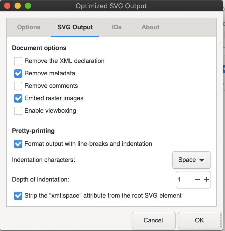
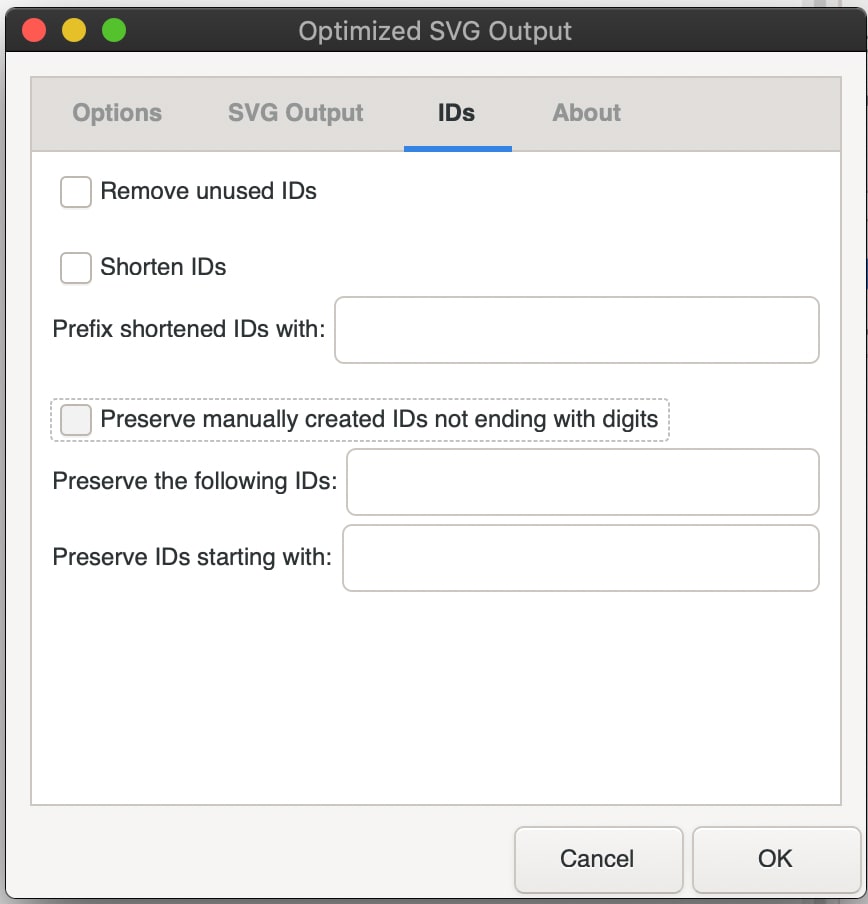
- You’ll want to select your “File Type” as an Optimized SVG. Here are the parameters I typically use. Again, this may not be a one-size fits all, but it’s a great start.
Tying an SVG to a Splunk Search
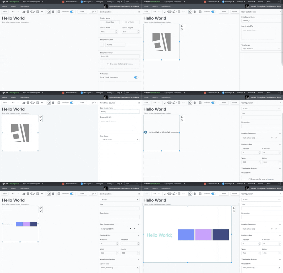
Tying your newly created SVG to a Splunk Dashboard is where the rubber meets the road for “painting with data.” Assuming you already know how to create visualizations like line charts, barcharts, and other Objects inside of the new Splunk Dashboard framework — you’ll be picking up SVGs in no-time. With a little practice, these visualizations become second nature, and extremely compelling. Below you’ll find a GIF of how to create one of these very basic SVG visualizations.
- Creating a new Dashboard, clicking on the “Add Chart” icon, and selecting an SVG.
- From there, you can add your search of choice. In most cases, you’ll want a very basic search with two columns: a column that matches up to your ID in your SVG, and another column with a numerical value. Here is the example I use in the GIF Below:
| makeresults | append [| makeresults | eval id="hello_world" | eval count=0] | append [| makeresults | eval id="block1" | eval count=1] | append [| makeresults | eval id="block2" | eval count=2] | append [| makeresults | eval id="block3" | eval count=3] | table id count | search id =*
- Finally, you’ll select the SVG image you have created.
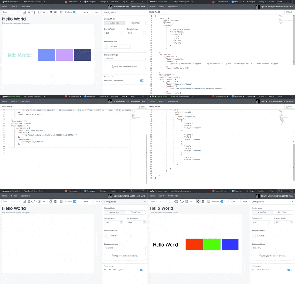
Optional Step: You can also add in dynamic ranges to your SVG. This is where you can say something like “If the value of id=this is greater than value=that, set the color of this part of the SVG to that”. I’m going to show that example below. But keep in mind that we also allow for gradient painting of SVG files. I’ll cover an example of that as well inside of the git repository I am sharing at the end of this blog.
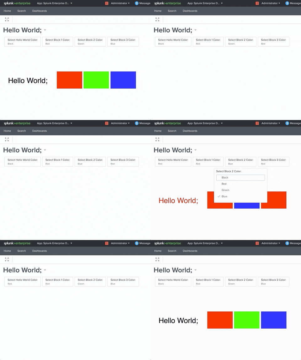
Optional Other Step: You can also add in inputs, to dynamically control the coloring on this SVG.
More Complex SVG Creation: Maps!
Sure, my Hello World example may not have been the compelling example you were looking for. But it highlights the fundamental parts of the SVG feature that are so important, and explains some of the fundamentals of using this new feature. Some of the more popular Choropleth SVG use cases that I have been enjoying creating so far are custom Choropleth maps.
City Level Maps:

State Level Maps:

With COVID-19 on the rise, people are even more interested in seeing maps on a micro, and macro level. Splunk for Good has been hosting a series of COVID-19 Maps that you may have seen. We’ve had requests for maps on the City Level, County level, State Level, Country level, and even global maps. While all of these maps can technically work, keep in mind that beauty is in the eye of the beholder and not all maps will work for all use cases or for all audiences. Additionally, not all maps will perform equally well. Maps with an extreme level of granularity may not be as aesthetically pleasing, and it also can add a lot of rendering time. The simplify feature of mapshaper is a great way to reduce map complexity, and speed up performance.
All that being said, maps, and even PDFs, can be converted into SVG files. That is, as long as you know the right tools that are out there to create them. That was one of my big blockers in this process, so I’m here to offer a shortcut for you and give a summary of some of the tools I’ve found useful, along with an example.
We’ll start out with a classic example: a KML File. I’m focusing on KML, because I know a lot of customers and Splunkers alike that currently use KML files in Simple XML.
Summary of Useful Tools
QGIS:
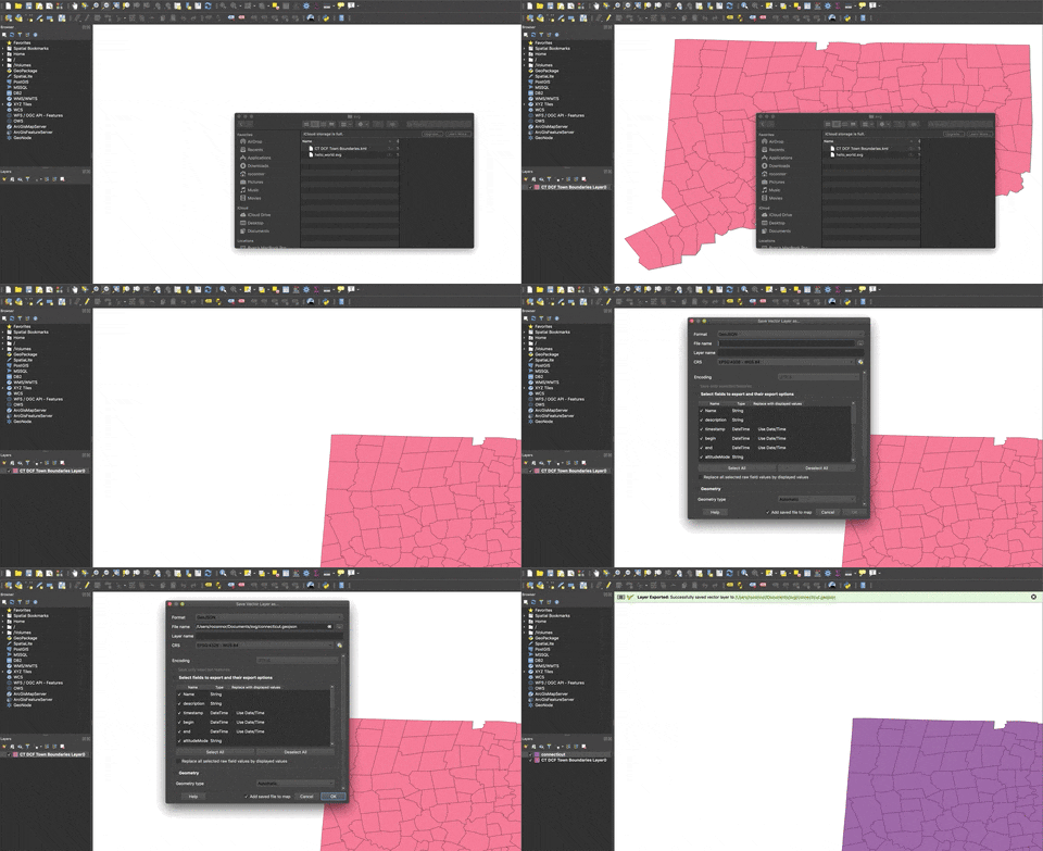
If you have a KML file from your old Simple XML Dashboards, and you want to convert it to something more friendly for SVG creation, QGIS is for you. This isn’t the only GIS platform out there, it’s just one that I’ve found useful along this journey. There are plenty of KML conversion offerings and github repositories out there, but I went with a tried and true GIS solution to get the job done. Suffice it to say that there is plenty of documentation around the web for using QGIS. I’ll give you the tl;dr version of why this tool is important with Choropleth SVG creation: it can make converting a KML file to something more open, like GeoJSON or Shapefiles, a snap. It can be as simple as importing your KML, right clicking on the layer, and selecting “Save As” as seen in the GIF below using this file from the State of Connecticut website.
- Web Frontend: https://mapshaper.org/
- NPM Package: https://github.com/mbloch/mapshape
This is an extremely useful tool for converting many different formats of geographic files into many different other formats of geographic files. I’ve personally been able to find maps in several different formats, and convert them to SVG. As seen in the example above, I was able to Google for a State of CT KML Map pretty easily. As of writing this, mapshaper had their “output” switch documented as being able to output to the following file formats including the ones listed here. The important thing to note here, is if you have a map that is available in one of the below formats, then QGIS is not even necessary for Choropleth SVG creation. You can go straight from a GeoJSON or Shapefile -- > straight to an SVG.
Output Formats:
- shapefile
- geojson
- topojson
- json
- dbf
- csv
- tsv
- svg
Input Formats:
- shapefile
- JSON
- geojson
- topojson
- DBF
- csv
- tsv
One of my favorite parts of mapshaper, is though you can install their npm package and run commands locally to generate these files, you also can very easily use their web interface. Here is a quick tutorial of how I converted my Connecticut map, followed by some popular switches that I often use for my commands to convert maps (either in the web interface or locally).
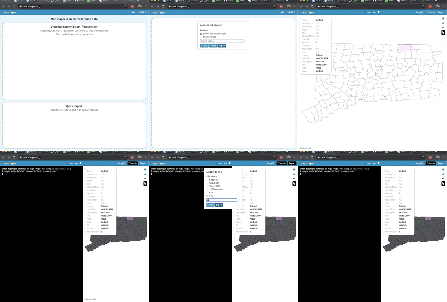
Useful Commands:
-style fill="#43454B" stroke="#23242B" stroke-width="1"
Style your SVG. Visually appealing SVGs make for more visually appealing dashboards. This style works well for SVGs with Splunk Dark Mode
id-field=POSTAL
Identify your Polygons! Important command used for identifying the polygons inside of your SVG. These are the IDs of the column/state/country you want to “paint”. They should match up to the data you have in Splunk.
-simplify 40%
Simplify your SVG. A method of rendering the SVG faster. This isn’t necessary, but it may speed up performance in some cases. It also can make some SVGs more visually appealing. 40% is a number I find useful in a lot of cases, but you can feel free to adjust as necessary.
-explode
Ungroup Objects. In some cases, this switch can be used to ungroup objects that you don’t want grouped. I usually default to this for most maps, but there may be cases where you don’t want to use this as well.
-filter "name != 'Antarctica'"
Filter objects. In some cases, you may want to get rid of some portions of the SVG that aren’t ever going to be used. If you don’t have an office in Antarctica, why have it on the map? Some maps also may have erroneous objects that aren’t relevant, such as maps that have an “Unknown” section.
-filter expression="STATEFP==51 || STATEFP==24 || STATEFP==11"
Example of keeping only part of a map with map shaper. This will keep only states with Federal Processing codes 24, 51, and 11.
Grand Finale: A Map Creation Example
With the above tools, tips, and tricks — I showed you how to make a custom Choropleth SVG in Splunk, and paint that object. I also showed you how to convert a KML, to a GeoJSON file, and then to an SVG using QGIS and Mapshaper. Thankfully, though this process is a tad tedious, the number of towns in your state, or zip codes in your county, won’t be changing too often. You also may be able to skip your KML files entirely if you can find a new map on the web that is already in a format like GeoJSON or a Shapefile. Don’t underestimate the power of your resident GIS expert at your company either.
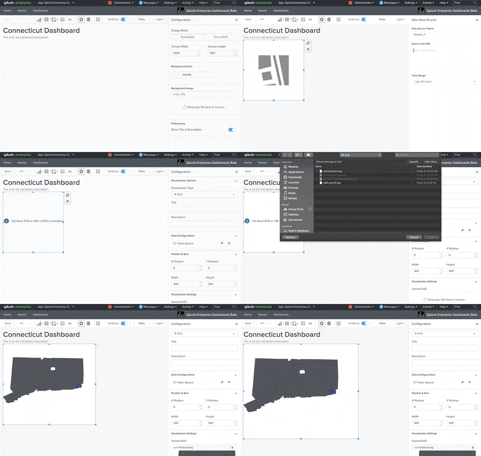
Once you have this SVG file of a map, the process for adding it to Splunk and working with it is very similar to the Hello World example above.
Step 1: Create the new Dashboard, SVG Object, and Add your Search
Step 2: Wire Up your Color Ranges
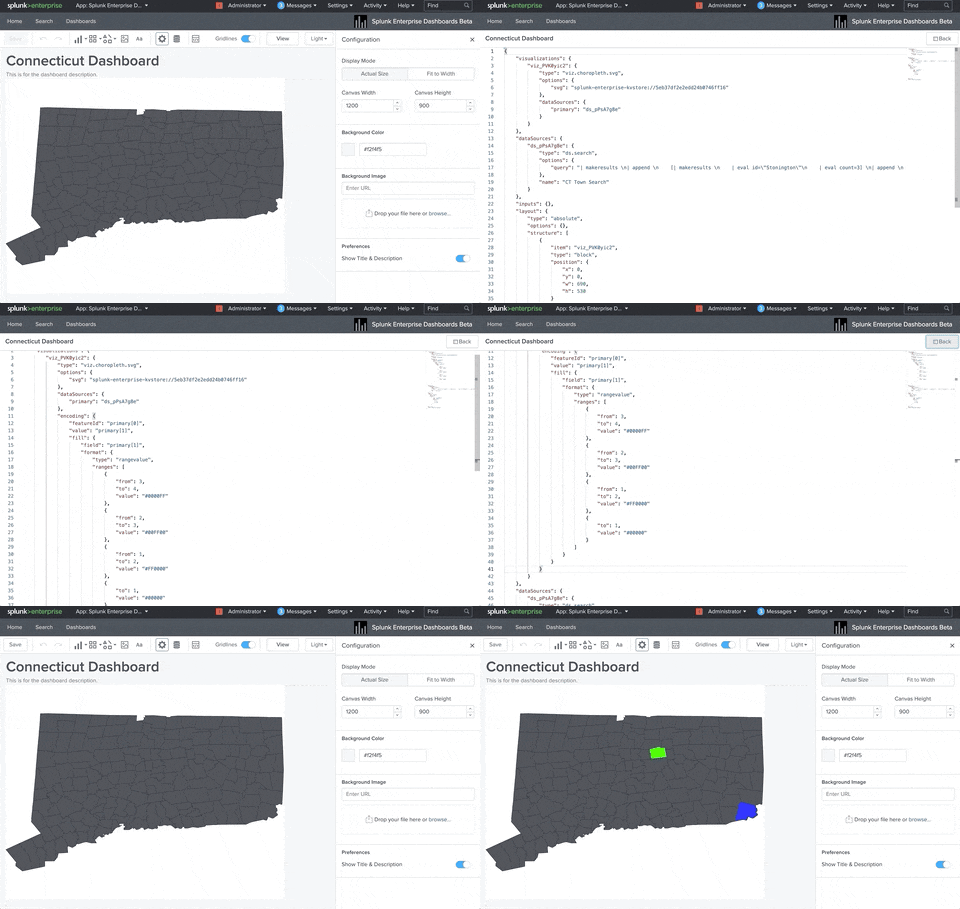
Creating an SVG Object in Splunk is straight forward, and makes for some seriously compelling dashboards. It’s been fundamental to the effort Splunk has had around disseminating live, publicly available data, around COVID-19. I can’t wait to see the use cases our customers, Splunkers, and Community come up with next!
For the Hello World SVG Example, see this github repository.
----------------------------------------------------
Thanks!
Ryan O'Connor
Related Articles
About Splunk
The world’s leading organizations rely on Splunk, a Cisco company, to continuously strengthen digital resilience with our unified security and observability platform, powered by industry-leading AI.
Our customers trust Splunk’s award-winning security and observability solutions to secure and improve the reliability of their complex digital environments, at any scale.

