Advanced Link Analysis, Part 3 - Visualizing Trillion Events, One Insight at a Time

This is Part 3 of the Advanced Link Analysis series, which showcases the interactive visualization of advanced link analysis with Splunk partner, SigBay. To find the rest of the series, check out "Advanced Link Analysis: Part 1 - Solving the Challenge of Information Density" and "Advanced Link Analysis: Part 2- Implementing Link Analysis," and if you’re ready to get started today, check out the Sigbay Link Analysis app on Splunkbase.
The biggest challenge for any data analytics solution is how it can handle huge amounts of data for demanding business users. This also puts pressure on data visualization tools. This is because a data visualization tool is expected to represent reasonably large amounts of data in an intelligent, understandable and interactive manner. Additionally, such visual representation needs to be actionable, and not just a generic but pretty picture.
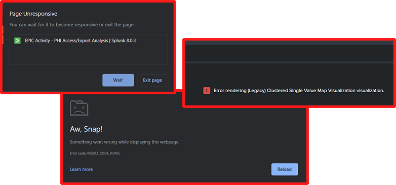
If you’ve ever observed dashboards freezing, warnings or errors about excessive number of data dimensions, high volumes of data, never ending hourglass buffering, progress bars not progressing — these are likely consequences of excessive volumes of data that neither dashboard nor given visualizations can handle.

The typical volume of data before visualization tools start misbehaving is around 5,000-20,000 points. Beyond that (as we demonstrated in Part 1 of these series), the image quickly becomes non-actionable or visualization technology fails to properly render large volumes of data points.
SigBay released ver 2.x Beta of their visualization tool for testing, which is designed to handle extremely large datasets. Ver 2.x was successfully tested on datasets of around 200,000,000 events, however the theoretical limit within Splunk could be pushed way higher.
To allow business users to visually investigate large volumes of data, SigBay implemented logic called Automated Intelligent Sampling Technology (AIST). AIST’s approach requires creation of a few fields within the data model to emulate “sampling”.
To Note: Splunk natively supports sampling for data within indexes, however sampling is not supported for accelerated data models (which are required for Link Analysis viz). Sampling is a great (and underused) approach to peek into large volumes of data in a fraction of a time. Native sampling is also supported for indexes within SimpleXML dashboards.
Supporting Large Datasets for Advanced Link Analysis
Here are a few technical details about underpinnings to support large datasets within Sigbay link analysis visualization.
To support sampling with accelerated data models, users need to create a few evaluated integer fields such as: r_10, r_100, r_1000, r_10000. Each such field represents the sampling ratio. Here’s the formula behind some of these fields:
r_10 = if(random()%10=0,0,1)
r_100 = if(random()%100=0,0,1)
r_1000 = if(random()%1000=0,0,1)
The logic behind each of this formula is to generate a random number and assign value 0 for each 1 / N-th event. All other events will be assigned a value of 1. For example for the r_1000 field, approximately every 1/1000-th event will have a value of 0. All others will be 1.
When a user adds these fields to a data model, link analysis automatically detects the presence of such fields and enables AIST sampling logic automatically. The names of the fields can be customized in the settings.
What kind of problem does sampling solve? In short, it prevents visualizations from overloading or failing when there is too much data flowing back as a result of user request.
Without sampling, visualizations can sometimes fail. Normally, every time a user interacts with the visualization, a number of custom SPL queries are being generated and sent to Splunk via API. However, the visualization can sometimes fail because there are too many results or memory issues.
Also it wouldn’t make much sense to visually render connections for 100,000,000 events — the result would look confusing and too messy to devise any actionable insights. To prevent this from happening, Sigbay’s Advanced Link Analysis applies sampling to retrieve an evenly randomized fraction of results. Sampling ratio is calculated to ensure no single node receives more than 10,000 events. The actual formula is a bit complex and depends on the number of currently selected or excluded nodes at a time of user click.
After initial loading, the visualization already knows the “stats count” number for each node (number of events for each value within top 100 values for each column) and this allows visualization to calculate sampling ratio before sending the query to Splunk.
In perspective, the random() function generates pseudo random numbers in the 0...2,147,483,647 (up to 2.1 billions) range. Which allows to create maximum sampling field for up 1 billion:
r_1000000000 = if(random()%1000000000=0,0,1)
With the limit of up to 10,000 events max per field, this auto sampling logic theoretically allows visualization to work for datasets of up to 10 TRILLION EVENTS.
Here’s example of how sampling ratio is being calculated for different values of count:

Now, as sampling returns only a fraction of all available events, what are we missing? Link Analysis allows us to override sampling ratio manually so we can compare sampled results with full results.
Comparing Sampled Results with Full Results using Advanced Link Analysis
Let's do the experiment to understand the difference between sampling and full data investigation results. For this I used 1.2 million events dataset representing real world traffic to the web server. I want to understand which countries and which IP addresses are using the most frequently appearing browser: “Mozilla/5.0 … Trident/6.0”.
In the Link Analysis visualization, you just need to click on the http_user_agent value of interest to get results.
So I made two tests:
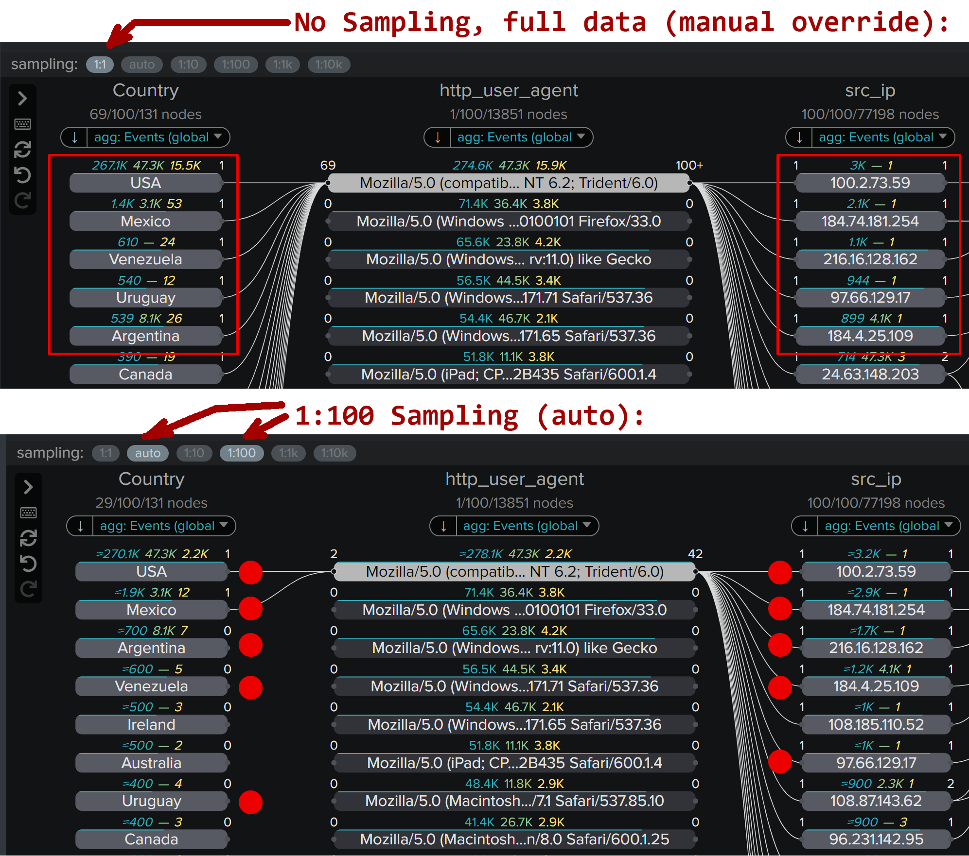
- Top part: this is where I forced 1:1 sampling (full data) - this loads slower because the top browser is responsible for 274,000+ events.
- Bottom part: automated sampling 1:100 is used - which means visualization requested only 1/100-th of all results!
On the top part of the image red rectangles show top countries and top IP addresses. Ideally we want full data results matching as close as possible to sampled results. Red dots shows the matching countries and IP addresses in version where sampling was used:

These tests basically show us that we are getting pretty close results from full data and 1:100 sampled data. Top most active nodes are even appearing in the similar order in both tests. However, with sampling we are getting results significantly faster and this approach is scalable to huge datasets as well. As a general rule, sampling works well when nodes of interest are appearing in lots of events, which indicates that the results are very similar.
Less frequent nodes will likely appear out of order and rare nodes may not show up at all for high sampling ratios.
However, users can always manually override sampling to the next smaller value or turn it off at all if wanted to. But as a conclusion of the above test I do see that we’re reaching very similar results, discovering data elements of essential interest with 1/100 of effort! This is going to scale.
What I really love about sampling is that regardless of how much data you have, it’s the same point and click on nodes that allows you to do investigations. This, of course, applies to Sigbay Link Analysis version 2.x beta.
Another good feature added with sampling is automatic estimate of the number of true results for each node. Estimated values are shown with ~ sign in front of them, and while they’re not precise numbers, they give a good idea of the approximate count for each value.
Points to note:
- Other (non count) aggregate functions (such as ‘dc’, ‘sum’, ‘avg’ and you may use up to 5) are not estimated because quite often it’s impossible to do it correctly for the random sampling.
- When sampling is triggered, make sure to change default sorting order by ‘count’ aggregate, and not by any other aggregate functions
- This is because ‘count’ will return the corrected estimated result, and other aggregate functions will not. For example, values of all aggregate functions will only be calculated for random 1/1000 results, but ‘count’ will additionally be multiplied by x1000 after that, while other functions remain untouched.
- However, if there is a correlation between ‘count’ (number of events) and other aggregates (say ‘sum(bytes) as total_bytes’), the nodes appearing on top will still likely be the ones of interest for further investigations.
Testing Link Analysis with Real Datasets
Let's take some tough tests with very large datasets to see how well Sigbay Link Analysis supports this.
For this test I downloaded the complete DEA Arcos database published by Washington Post. DEA ARCOS database tracks the path of every single pill sold in the USA by manufacturers, distributors to pharmacies and doctor offices across every city, state, and zip code. This is a gigantic CSV file - about 80GB uncompressed set containing more than 178 million records spanning 7 years of historical data.
I’ve created initial dashboard with no filters applied, meaning the visualization is forced to analyze *EVERYTHING* on initial load:
This initial view took about 1 minute to render with 8 columns of interest. To explain what Sigbay Link Analysis does on initial load:
- Analyzes the dataset (all 178+ million events) to discover most frequently used values in every chosen column.
- Finds top 100 most frequently occurring values for each column (default limit of 100 that can be changed).
- Discovers connections between these values.
- Calculates aggregate function for every value in every column (in my test case this was ‘count’ and ‘sum(drug_quantity) as Pills’).
- Renders the result - resulting up to about 2,400 data points: (2 agg. functions +1 field value) x up to 100 values limit x 8 columns.
Once it was loaded I noticed that the top state by opioid purchases is California, showing 13.9 million ‘count’ events (number of purchase orders - Records) and a total of 54.1 million opioid pills purchased.
At this point, I want to analyze California to reveal who the biggest purchasers of opioids are in California by buyers' names, from which city, ZIP code, etc. To do this, I clicked on buyer_state = “CA”
The results are rendered in 01:58 - just under 2 minutes. I noticed that for such a query - the sampling of 1:10,000 was triggered due to the huge number of Records (‘count’ aggregate) for California. The results show the top cities for opioid purchases, top ZIP codes of buyers and top list of buyer names.
To make things a bit more complicated - I selected CA and buyer_type = “PRACTITIONER” to discover the biggest individual buyers of opioids in California. This query took 01:46 and used automatic sampling of 1:1000 - due to more narrow filtering.
Link Analysis visualization handled this gigantic dataset gracefully albeit it took a little while for results. However, this dataset was in no way optimized or organized for high performance. The only drawback of tapping into gigantic datasets is the longer response time. To minimize time during the investigation Link Analysis calculates ‘counts’ stats for every single node in the top 100 list once for each column and saves this internally. This data helps to intelligently choose proper sampling ratio and properly sort nodes to always show the most interesting nodes on top.
Little bit more complex and more realistic test was done on a synthetic dataset within the Splunk Medication Access Analytics system. Medication Access Analytics is a Splunk product developed for hospitals to detect opioid and control substance diversion.
This dashboard represents the view into data events recorded as doctors and nurses access medications within secure cabinets in hospital environments. There are a total of more than 5,500,000 events with 9 columns of interests.
It took only about 6 seconds to run a complex query to discover top users removing narcotics from secure cabinets, but excluding any user employed within the multiple “pharmacy” departments (which are mostly doing restocking).
Similar performance with complex filters was shown while analyzing Web traffic dataset. It took only about 5.5 seconds to retrieve results of the query to show all traffic sources and connections causing server errors (status>=400) for GET and POST requests. This query contained multiple selections and exclusion clauses and leveraged sampling of 1:100 due to a large number of events.
Conclusion
I was pretty impressed by this update to the Sigbay Link Analysis visualization, which allows true enterprise class analytics over very large datasets.
At Splunk, we’re helping thousands of customers to gain actionable insights from their data and isolating business oriented users from complexities of analytical systems has always been a challenge. Another challenge is to prevent large delays and failures of in-browser visualization panels when too much data is requested.
Sigbay found an intelligent “foolproof” approach to these challenges to automatically reduce backend loads, data flow bandwidth and front end memory requirements with their Automated Intelligent Sampling approach.
Business users, analysts and investigators can now focus on business needs during investigations while the visualization tool crafts the necessary data API query “under the hood” to deliver users actionable, intelligent data insights. We hope to see more customers using advanced visualization tools like this within Splunk applications and dashboards to gain more insights from their data.
Related Articles
About Splunk
The world’s leading organizations rely on Splunk, a Cisco company, to continuously strengthen digital resilience with our unified security and observability platform, powered by industry-leading AI.
Our customers trust Splunk’s award-winning security and observability solutions to secure and improve the reliability of their complex digital environments, at any scale.


